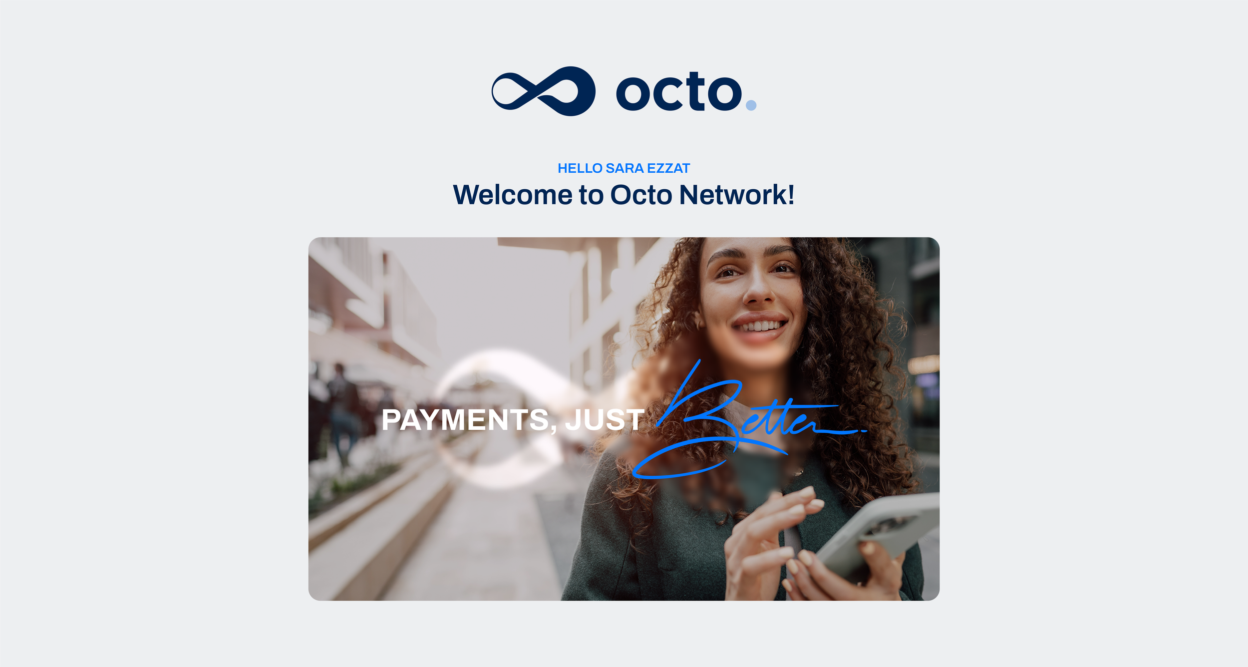
OCTO.
Just Better

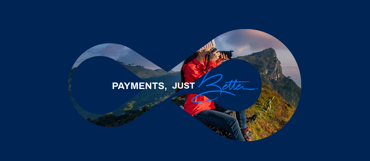
Payments, Just Better
A design case study of simplifying everyday transactions for a large and growing user base.

Everything at your Fingertips
The Challenge
Octo is a financial services company that offers innovative payment solutions and personalized credit options. Their platform aims to simplify everyday transactions, providing users with comprehensive control over their finances through a mobile app and user-friendly interface.
I have had the pleasure of working with Octo, a fintech startup, to create a reliable and youthful brand identity. Our challenge was to effectively communicate the brand's essence of infinity and boundless possibilities while ensuring the messaging resonates with diverse demographics and user needs.
My Tasks
Branding Solutions
Brand Naming
Logo & App Icon Design
Brand Identity Design
Brand Guidelines
Physical Visa Cards Design
Customized Presentation Template
Pitch Deck
Print & Digital Material Design
Just Better Typography
01. Brand Name Concept
The Power of Infinity ∞
The process began with creating a name that would reflect the concept of infinity and limitlessness. We explored numerous possibilities. Ultimately, "Octo," which derived from the Latin word for the number eight, was the best fit. It aptly represented the idea of infinity. Plus, it's short, easy to pronounce, and distinct—making it a memorable choice that stands out.


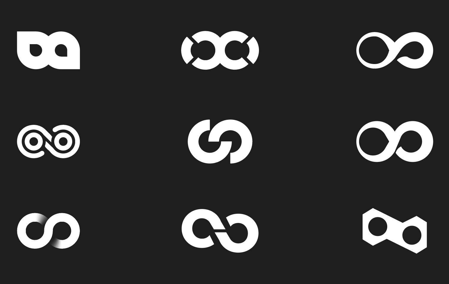
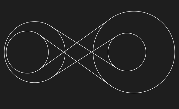
02. Logo Concept
Crafting a Unique Symbol for Octo
Right from the beginning, I had a clear vision of incorporating the concept of infinity into the symbol for Octo. However, the real challenge was to make this infinity symbol truly unique and representative of Octo's identity.
At this stage, I was working on various approaches where all the versions were based on the infinity symbol. Below are some sketch ideas I came up with:
By incorporating the concept of flexibility into the infinity symbol, the logo truly came to life with purpose, allowing me to differentiate it while effectively capturing the essence of smooth payments and endless opportunities. This resulted in a distinctive and unique logo mark that embodies flexibility.
→


03. Brand Colors
Discovering the Brand’s Palette
After color testing and explorations of variants of colors, Blue shades were chosen as Octo's main color because it conveys a sense of trust, reliability, and professionalism. This choice aligns with the brand's goal of being smart and engaging, allowing for the creative integration of energetic and personalized colors that enhance the overall experience that evokes vibrance and enthusiasm.


04. Brand Creation
Your Key to Consistency
To ensure brand consistency, I created detailed brand guidelines that outline our visual identity, including logo variations, color palettes, typography, pattern and visual applications to show how the brand would look like on different platforms for print and digital usage.
These guidelines ensure the uniform application of the brand identity across all materials, maintaining a recognizable and professional look.


05. Graphic System
The Seamless Pattern
The graphic system represents a seamless pattern created from the logo mark serves as a unique and cohesive design element that reinforces brand identity. It conveys a sense of fluidity and innovation, while ensuring that the brand remains recognizable across various applications.