

MAGICWORK.
Your Digital Companion.

Your trusted guide forward
A design case study focused on creating a minimalist and transformative user experience for guiding individuals through their mental wellness journeys.

A Holistic Brand Development
The Challenge
magicwork, a Berlin based product app, is a groundbreaking brand that revolutionizes mental wellness on the psychedelic journey. With a focus on minimalism and transformation, I have created a brand identity that aligns perfectly with its mission of guiding individuals through profound and transformative journeys.
My Tasks
Branding Solutions
Logo & App Icon Design
Brand Identity Design
Brand Guidelines
Customized Presentation Template
Stationary Design
UI Design
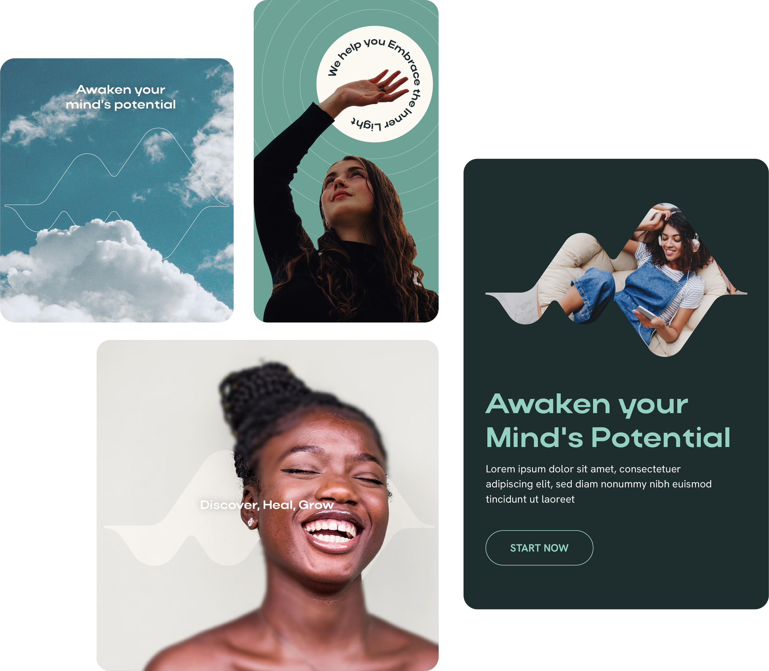
01. Brand Mark Concept
Waves of Transformation
I aimed to capture the sensation of a heartbeat, as it is one of the most palpable sensations during an experience. This artistic fusion symbolizes the ups and downs, the flow, and the transformative nature of an experience. Cleverly combining the representation of the flow/wave with the initial letters from the brand name, "Magic Work".


02. Brand Type Concept
The Typography Experience
We went through multiple iterations to select the ideal typography for magicwork, as achieving the right balance was crucial. The chosen typeface is a wide sans-serif font, which offers a spacious and open look. These broader letterforms evoke a sense of stability, balance, and modernity.

03. Brand Colors
The Heartfelt Color
I've always had a soft spot for dark teal because it represents growth and harmony, and it has such a calming effect. When I combined it with a light cream color, it added a touch of warmth, purity, and simplicity. This was really important for magicwork, as we wanted to connect with people looking for peace and calm in their lives, helping them stabilize their heartbeat and find a sense of balance.

I selected these accent colors to reflect the soothing hues of a sunrise, which evoke a sense of calm. By adding light purple, light teal, and orange to the dark teal and light cream, the magicwork brand creates a visually appealing and harmonious palette that inspires feelings of tranquility and new beginnings.


04. Frame Layout
Designing Harmony
The logo mark can beautifully frame photography, illustrations, and content, enhancing the overall design. Additionally, using the circle as a framing layout throughout the brand adds depth and represents meaningful concepts like continuity, flow, focus, and centering, contributing to a holistic experience.

05. UI App Design
Transforming Vision into Experience
After developing our brand identity and establishing a cohesive branding system, I had the opportunity to work on the UI design for the app's MVP. This transition felt natural, as the visual language we created—through colors, typography, and logo design—served as a strong foundation for the user interface.
As we worked together, our main goal was to enhance the user experience. We ended up tweaking the app's flow several times, each iteration bringing us closer to something truly intuitive and engaging.
This whole journey has been incredibly rewarding. Seeing how our brand identity seamlessly translated into the app’s UI design has been exciting, and I can’t wait to see how users connect with our brand in this new digital space!


06. User Journey
Exploring Our Three Core Experiences
The three main experiences in the app journey are designed to enhance user engagement and emotional awareness.
Check-In Mood: This experience allows users to reflect on and record their current emotional state, fostering self-awareness and mindfulness.
Prepare: In this phase, users can set intentions or goals, preparing themselves mentally for the day or specific activities, which helps in creating a positive mindset.
Integrate: This experience focuses on helping users incorporate their reflections and insights into their daily lives, promoting personal growth and emotional regulation.


